5 Interior design tricks for Home Staging perfection.
When tackling any home staging project it is important to use the right furniture and accessories, these need to be suitable for a few important factors such as the target demographic you are trying to attract, the location of the property, the size of the property, but also not forgetting they must sympathise with the property’s architectural style. There are a few easy wins to consider when home staging, these tricks of the trade are used by many luxury interior designers within London, so here is a sneak peak.
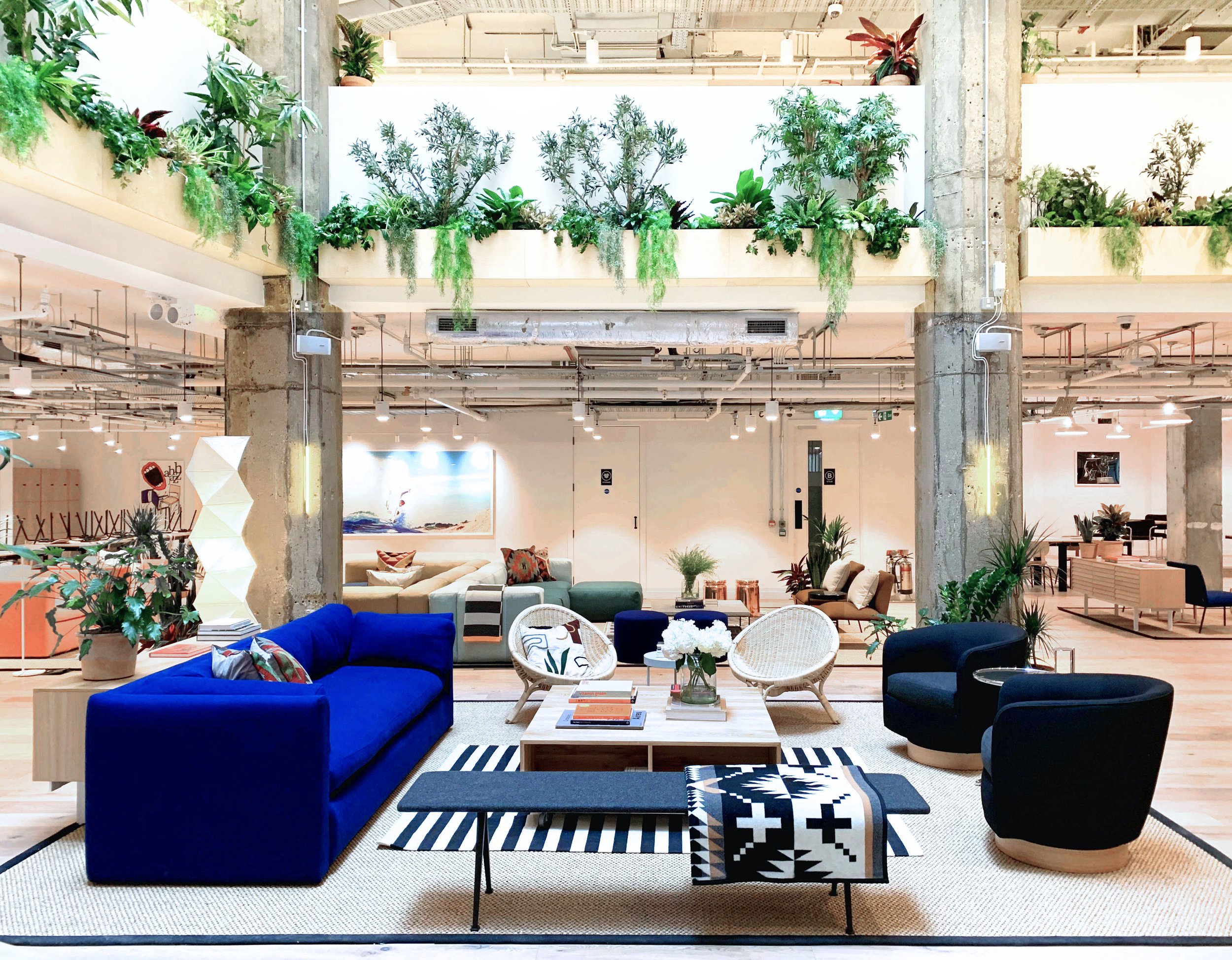
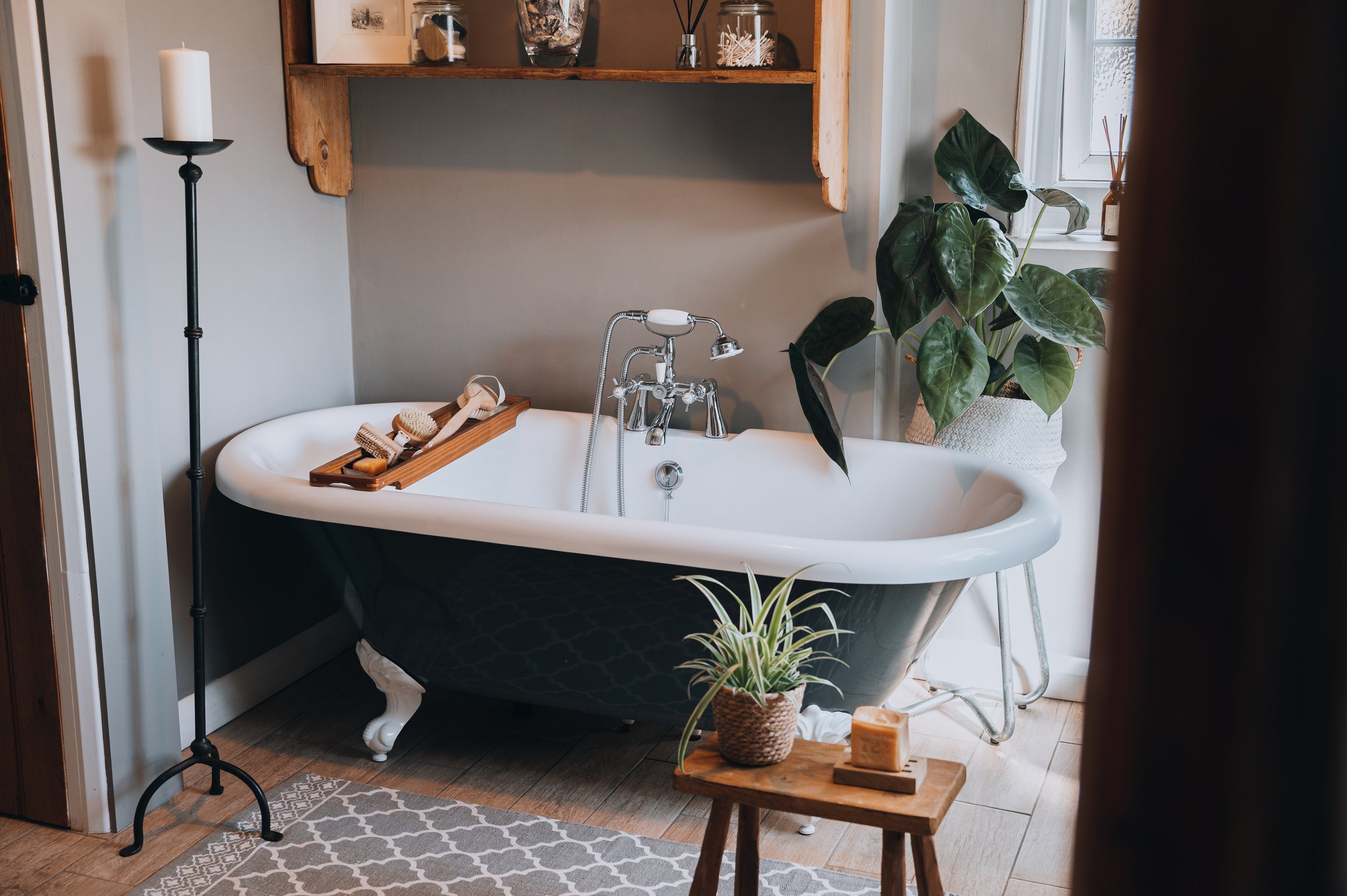
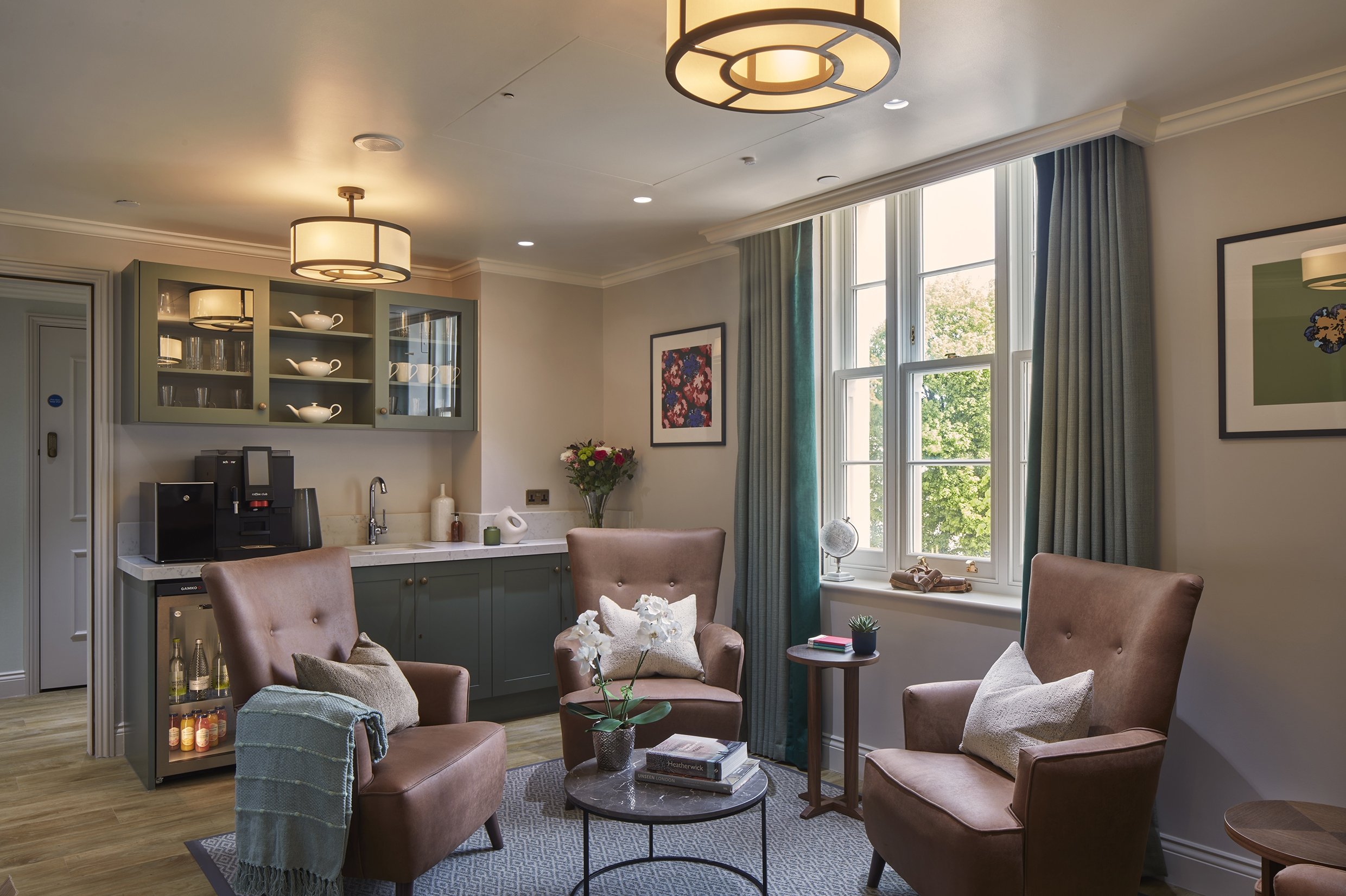
Bring The Outside In: The use of houseplants, flowers and alike whether real or otherwise really help break the monotonous language of any negative space within a room. That dead zone can be anything from a corner that needs some life, to a vast expanse of countertop space that requires breaking up. The use of greenery and indoor plants and flowers subconsciously soften their surroundings whilst instilling a feeling of being in nature, creating a tangible warmth to even the coldest of environments.
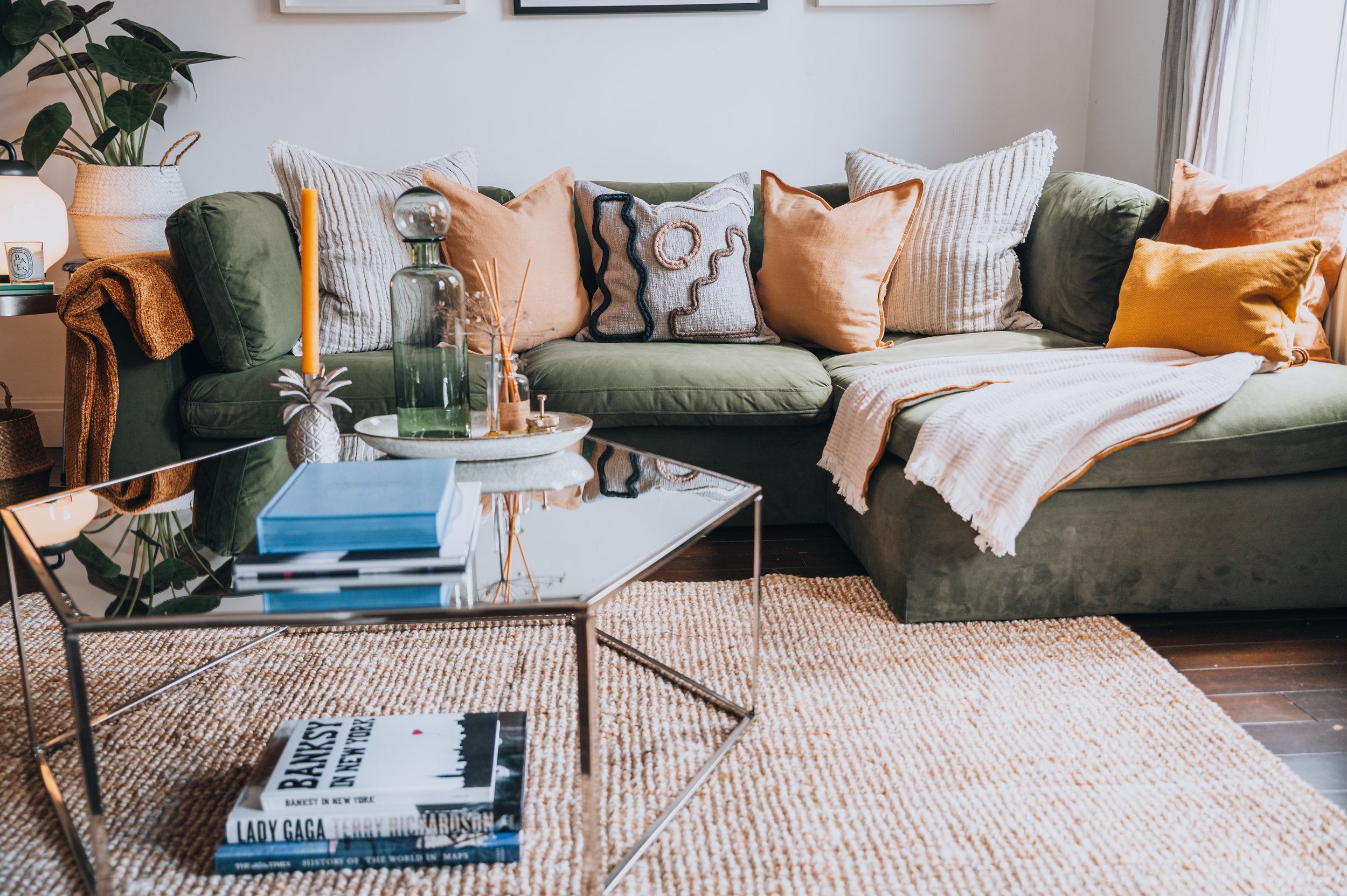
Grounding: This has nothing to do with the feeling of being centred, but is in fact is to do with rugs. Rugs are used to ‘ground’ objects such as coffee tables that sit on large areas of floor space giving the appearance of a connection between the floor, coffee table and rug. But you can also use rugs for the same effect with dining tables, large occasional chairs and also even applying a rug on top of another rug. When layering rugs and flooring it visually breaks up large expanses of the same material, giving more visual stimulation and creating ‘pockets’ or ‘islands’ of interest when taking in a bigger environment.
Art Art Art: The clue is in the name, art…it really is that important. As most people can appreciate, a large cold white wall is not the most inviting visual when walking into a space and doesn’t fill anyone with excitement. The trick to artwork is to not be afraid of being bold, large pieces on big living room walls is an easy win, especially when coupled with a nice mirror to create depth and space. But it is the little touches that make all the difference, such as memorable little framed moments in the bathroom or botanical pieces in the kitchen that really finish an interior.
Let There Be Light: Lighting can be tricky when trying to make a space look more homely, often you can over illuminate a space that then creates a very sterile and clinical feel, which no one wants. A good rule of thumb is to allow each ‘feature area’ to have two sources of indirect light, that can be from a table or floor lamp. Both of which usually work best when they create an indirect glow through either a shade or frosted/obscured glass. When placing both table and floor lamps, you want to try and aim for corners of spaces to allow the glow to come from the perimeter and ensure a less harsh illumination.
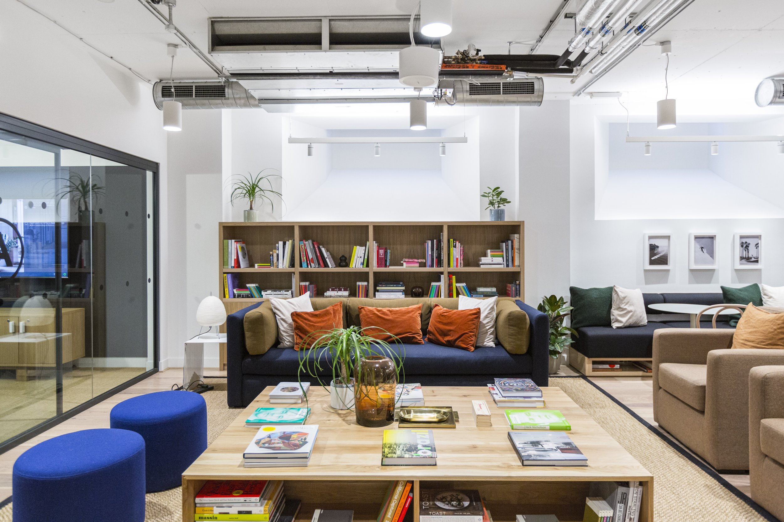
Dress To Impress: When faced with an empty coffee or dining table, the desire to just throw a vase of flowers in the centre is always the simple and appealing solution. But it is important to treat any surface with the same love you would give to say…making your bed; it should feel ‘complete’. This means dress it, dress it to create a table you want to sit at and be photographed by. Use large books, stack objects, and even use glassware if it has enough breathing space around it. If you dress the table to create a mini oasis for yourself, you will find you it becomes more of a feature within the space it sits.

